Proxima Nova
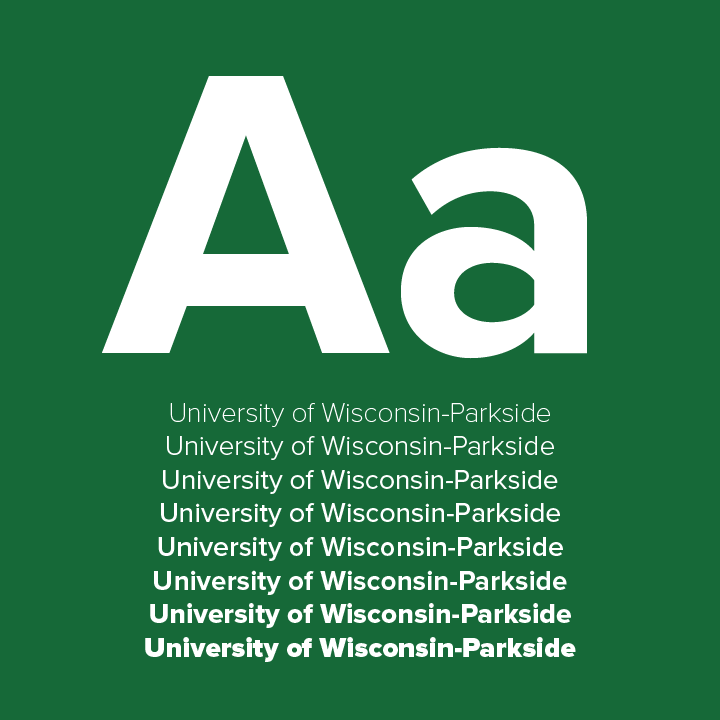
Proxima Nova was chosen for the website and collateral materials because of its modern appearance. Infographics and text icons for the website should be created in this font. The Proxima Nova family of fonts is approved for all uses and should be used for headlines, charts, captions, etc.
Mark Simonson, the creator, has this to say. "Proxima Nova (2005) bridges the gap between typefaces like Futura and Akzidenz Grotesk. The result is a hybrid that combines modern proportions with a geometric appearance. I originally released it in 1994 as Proxima Sans (now discontinued). I expanded the original six fonts (three weights with italics) into a full-featured and versatile family of 48 fonts (eight weights in three widths with italics). In the last few years, Proxima Nova has become one of the most popular web fonts, in use on thousands of websites around the world."

Open Sans
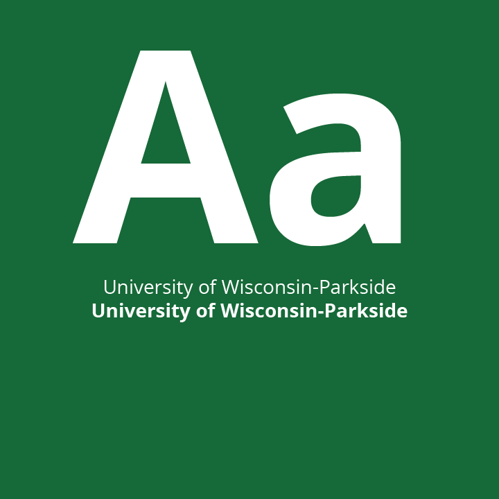
While Proxima Nova is the preferred, it is a premium font. Open Sans is an approved alternative.
Open Sans is a humanist sans serif typeface designed by Steve Matteson, Type Director of Ascender Corp. This version contains the complete 897 character set, which includes the standard ISO Latin 1, Latin CE, Greek and Cyrillic character sets. Open Sans was designed with an upright stress, open forms and a neutral, yet friendly appearance. It was optimized for print, web, and mobile interfaces, and has excellent legibility characteristics in its letterforms.
Open Sans can be downloaded for free from Google Fonts.

Serif fonts
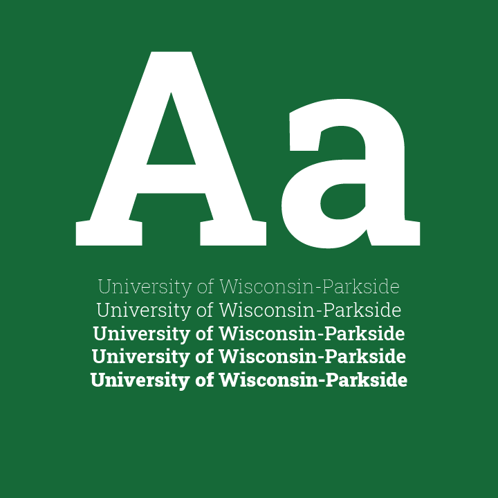
Gennerally considered outdated, serif fonts can be used for large bodies of text. Approved serif fonts include Roboto Slab or Garamond. Use the italic and especially the bold versions sparingly where style rules dictate the use or for emphasis. Do not use all caps when using a serif font.
Roboto has a dual nature. It has a mechanical skeleton and the forms are largely geometric. At the same time, the font features friendly and open curves. Roboto doesn’t compromise, allowing letters to be settled into their natural width. This makes for a more natural reading rhythm more commonly found in humanist and serif types.
Roboto Slab can be downloaded for free from Google Fonts.

Heading fonts
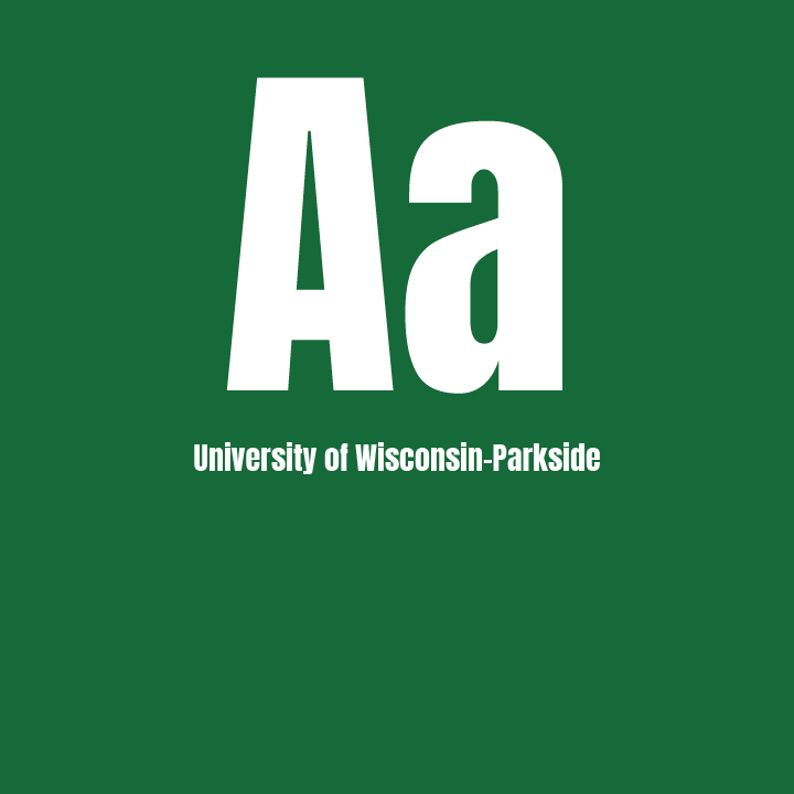
Proxima Nova can be used for headings, especially the bold and extra bold styles. Anton is an acceptable, and often used, condenced alternative.
Anton is a reworking of many traditional advertising sans serif typefaces. The letter forms have been digitised and then reshaped for use as a webfont, the counters have been opened up a little and the stems optimized for use as bold font.
Anton can be downloaded for free from Google Fonts.