The UW-Parkside Logo (Wordmark)
Our logo is just one layer of our visual identity – but it is at the center and represents the brand in its simplest form.
The logo is intended for use in print, web, video, and all other mediums for both internal and external audiences including publications, advertisements, posters, etc. It may also appear on promotional items such as pens, shirts, etc.
Colleges, divisions, departments, programs, and initiatives MAY NOT create and use their own visual identity solutions.
There are two approved versions of the logo. That said, research proves that the use of multiple and differing logos dilutes the impact and effectiveness of the primary identity of an institution and confuses target audiences.[*] With this in mind, we have designated the horizontal version as primary. We have further designated the reverse horizontal logo on a dark (green) background as preferred. The stacked vertical logo is an excellent option for sponsorship presence, such as a website listing. When participating in a sponsorship/partnership please provide the vertical logo. (Please avoid using any Parkside logos in a sentence.)
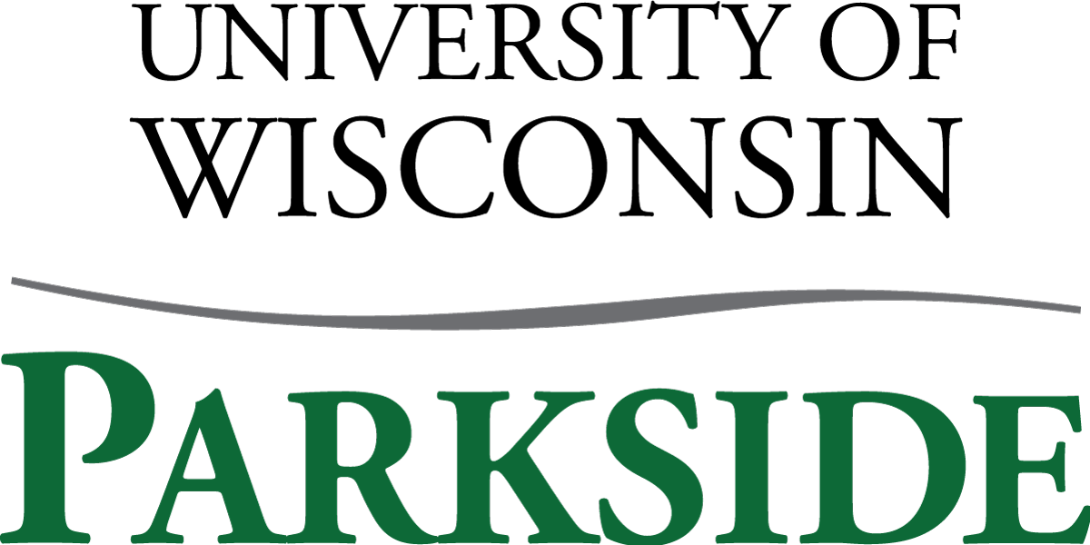
The logo is a combination of the university name and a swash that ties in to the UW System logo. All elements of the logo must be used together. Pieces of the logo may not be used separately to create new identifying marks.
Primary Logo
Horizontal
(in preferred instance)

Secondary Logo
Vertical
Download logos
Internal campus users may download and use the various University marks to meet official business, educational, and programmatic needs of the institution. Nonprofit organizations and public agencies collaborating with the University may use the University’s name, marks, and/or images either per the terms of a written agreement or upon request through written permission.
Acceptable colors
The Parkside logo may be used in two color Parkside green (Pantone #349) and black. It may also be used in a single color green (Pantone #349), black, or white depending on the background color.
A black logo may be used in black-and-white artwork when the background is light.
PREFERED: The white logo may be used on dark backgrounds, in black-and-white artwork, and when the background color clashes with the Parkside green.
Please contact Marketing for exceptions.
Acceptable Sizing
Primary/Horizontal Logo
FOR PRINT PIECES AND ADVERTISEMENTS:
Minimum height is .5” (for anything smaller than 8.5x11)
IN ADDITION, THE FOLLOWING GUIDELINES FOR MINIMUM HEIGHT APPLY:
- For 8.5”x11” Minimum height is .64”
- For 11”x17” Minimum height is .83”
- For 24”x36” Minimum height is 1.8”
- For 3’x6’ Minimum height is 5”
The above guidelines are for standard sizes. Logo must be scaled up from a standard size for nonstandard-sized printing.
Secondary/Vertical Logo
FOR PRINT PIECES AND ADVERTISEMENTS:
Minimum height is .75” (for anything smaller than 8.5x11)
IN ADDITION, THE FOLLOWING GUIDELINES FOR MINIMUM HEIGHT APPLY:
- For 8.5”x11” Minimum height is .9”
- For 11”x17” Minimum height is 1.15”
- For 24”x36” Minimum height is 2.5”
- For 3’x6’ Minimum height is 7.5”
The above guidelines are for standard sizes. Logo must be scaled up from a standard size for nonstandard-sized printing.
Acceptable Spacing
There are minimum spacing requirements around each version of the logo to keep the appearance clean and professional. The minimum space around the wordmark is equivalent to the height of “P” as it appears in the logo as shown below.
![]()
Unacceptable Uses
- Do not change the proportion or distort the logo.
- Do not remove any elements of the logo.
- Do not change color in any elements of the logo or make it into a gradient.
- Do not rotate the logo without permission from Marketing. Permission may be granted for items such as light pole banners and promotional items with a narrow vertical where the logo is the main visual element.
- Do not crop out portions of the logo.
- Do not combine other elements with the logo.
- Do not reset any of the fonts used in the logo.
- Do not use inappropriate resolution logo. Print = 300 dpi, PowerPoint = 150 dpi, web = 72 ppi. It's wrong if it looks fuzzy.
- Do not use below the sizing standards.
University Seal
Use of the university seal is limited to the Chancellor’s Office.
- The seal is reserved for formal publications (both electronic and print) such as diplomas, contracts, resolutions, proclamations, etc.
- The seal may also be used for formal occasions such as commencement, building dedications, and honorary celebrations.
- The seal may be reproduced in black, Parkside green (Pantone #349), or it may be reversed when it appears on a dark or conflicting background.
- The seal may be reproduced in metallic gold, silver, pewter, or other metals for items such as podiums, medallions, etc.
- The seal should not be used in place of the logo on brochures.
Approval to use the university seal can be obtained from Marketing.


Historic Logo
The historical logo is no longer used as a design element or as part of logos created by groups around campus. It should not appear in social media or on publications except where authorized by Marketing.
The historical logo appears below. It was originally created in 1967 for the university opening in 1968. According to the December 5, 1969, Parkside Collegian, the logo was created by Charles P. Reay a graphic design consultant with the firm in charge of designs of campus, signs, letterhead, uniforms, publications and vehicles. According to the article it was nicknamed “sticks and leaves” by students.

The historical logo is part of the university seal.